Intro to INEG Data Visualizaion Project

Analysis
Powerpoint
Visualization
Author

Me

Published

December 11, 2023

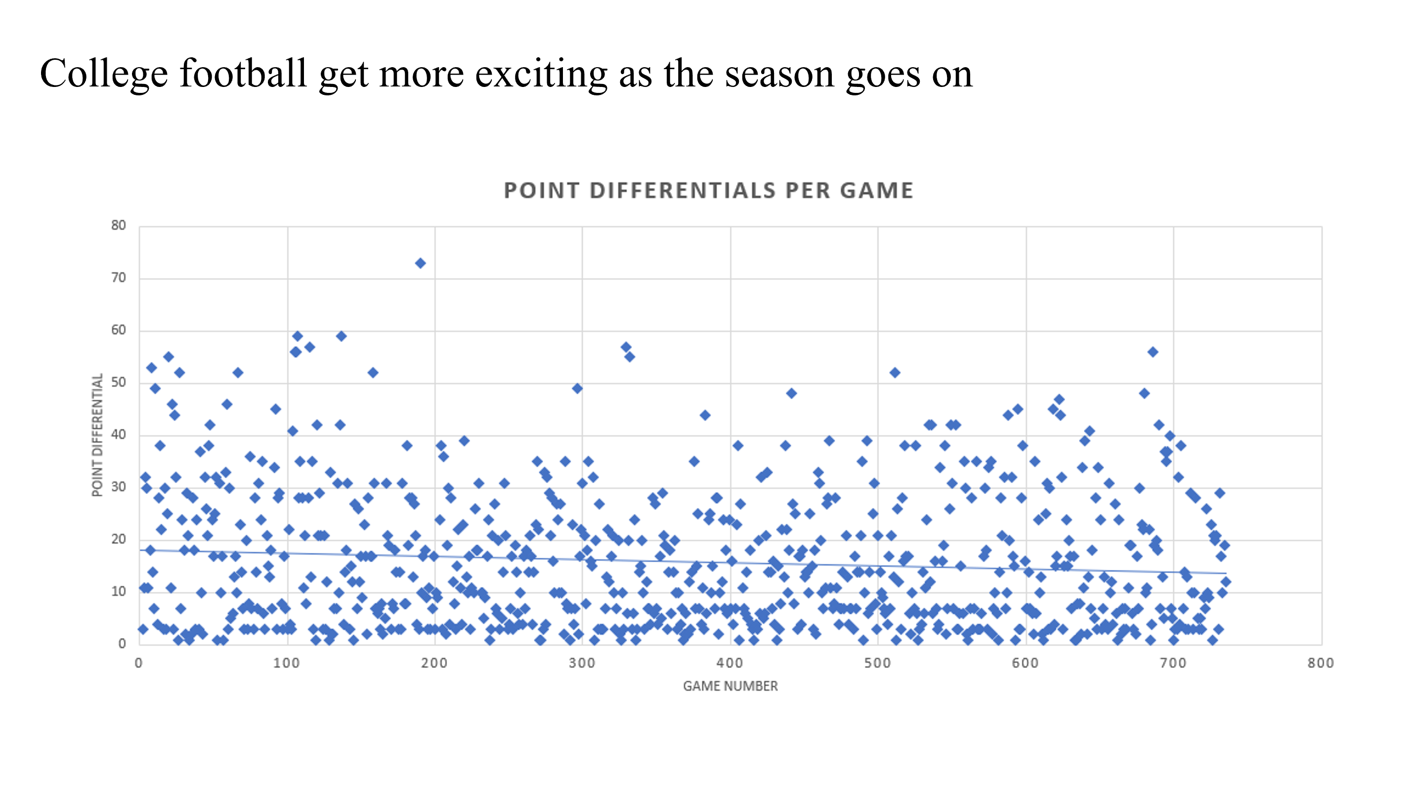
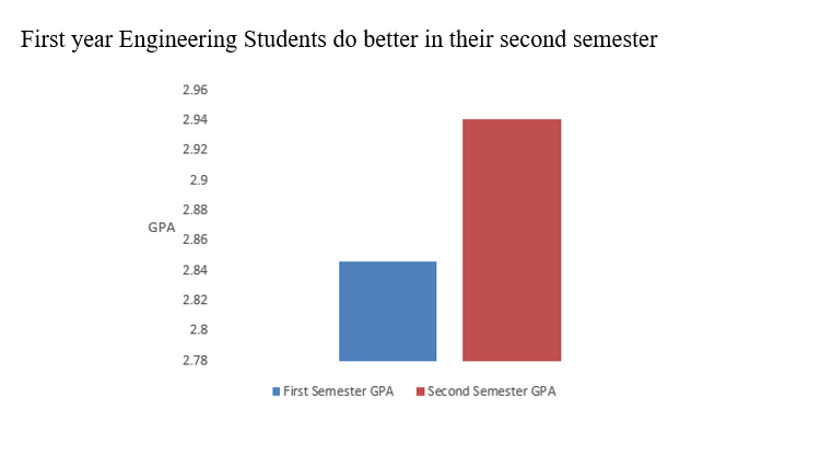
In my Intro to Industrial Engineering class, I was given claims to investigate along with two separate data sets. From the data sets, I was required to create a high-quality, assertion-evidence slide to summarize my results.

For this particular slide, I was tasked to see if college football gets more exciting as the season goes on. To help quantify this, I decided to measure point differentials per game, since closer games are usually more exciting. I then generated a scatter plot of my data and added a trend line to show that on average, football games get closer as the year goes on. Because of this, I was able to conclude that college football does get more exciting as the year goes on.

For this slide, I wanted to investigate the statistical distribution of GPAs of first year engineering students. To do this, I computed the average GPA from all student’s fall and spring years. Then, I created a histogram to compare the two. As it turns out, the GPA for first year engineering students is almost .1 higher in the spring than the fall.